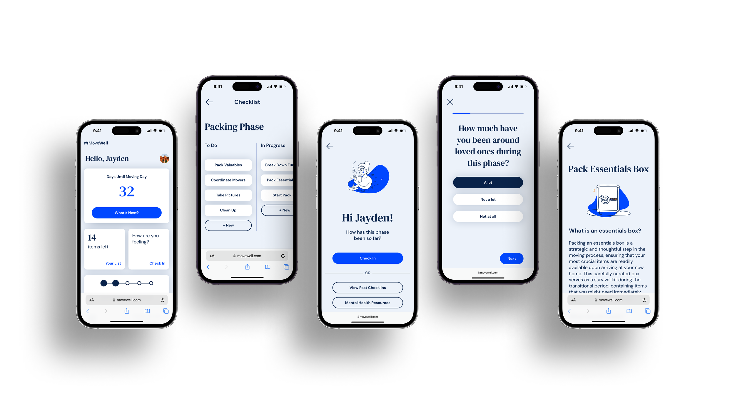
MoveWell
A responsive web-app that makes moving easier.
Role
UX/UI Designer
Duration
Nov 2023-Jan 2024
Project Type
Web-App Design
Background
Moving is hard. It requires a great deal of time, money, and effort. From scheduling movers, to crafting budgets, to leaving behind friends and colleagues, moving is difficult for a variety of reasons.
For some, moving is normal. Some people have moved dozens of times, and have a system which allows them to experience little difficulty during their moves. Others, however, may have never moved before, and don’t even know where to begin.
While some people have cultural capital and mentorship which provides guidance through the moving process, others may have seemingly nowhere to turn, and feel overwhelmed by the plethora of articles and informational videos on the internet.
There are surprisingly few resources for these movers to utilize, and there is an open window for a product that makes moving easier.
Gathering Insights
Research
In order to figure out what users in this market would need, preliminary research needed to be completed.
Specifically, I needed to find out two things:
What experiences, both good and bad, are common in moving?
What solutions can be offered to movers to help alleviate bad experiences?
User Interviews
I talked to four participants who had recently moved. In order to accomplish thorough, inclusive research, it was important to interview users who:
came from different backgrounds.
had recently moved.
had different financial means.
After talking with participants and gathering insight on their experiences while moving, I synthesized my research to find commonalities which could be addressed.
Finding patterns in user experiences
Affinity mapping allowed me to put participant responses in one place. By completing this exercise, I was able to recognize what patterns were revealed in relationship to the specific topics which I had earlier identified.
Problems
Affinity Mapping provided clarity on three problems movers commonly experience, and clarity on what I could focus on while creating a product. Specifically:
Moving is emotionally taxing, which negatively affects mental health.
Movers don’t have access to enough information regarding moving.
Moving can feel disorganized and complicated.
Defining Problems and Solutions
Creating Solutions
To more clearly understand what product I was to create from findings in my research, I needed to accomplish two goals:
Understand who my user was in order to design with more empathy.
Map out how my user would navigate through the product.
Identifying the users
In order to better understand who my target audience would be while designing the product, I crafted two user personas around findings in my research.
Mapping out user flows
In order to conceptualize how these solutions would look as far as key screens, tasks, and overall user experience, I crafted two user flows. Specifically, a check-in user flow and a checklist user flow:
Designing the Product
Wireframes and UI
Once user flows were created, it was now time to design the actual product. Starting with low-fidelity wireframes and moving upwards in fidelity, I learned three important lessons about the design process:
Don’t be married to ideas.
Work quickly in early sketches, and take more time as fidelity increases.
Constructive feedback and critiques are great assets to utilize.
Conceptualizing through sketching
My primary goal in low-fidelity wireframing was to sketch out some of the main screens and start building a visual framework around the user flows I had previously created.
Moving into mid-fidelity
Mid-fidelity wireframing allowed me to start thinking about UI elements, as well as more visual design decisions. I made some bold decisions in mid-fidelity. More specifically, I removed the onboarding flow and changed the layout of the checklist.
Creating components and UI
Before further refining my wireframes, I needed to develop what UI elements, components, and other style choices would be included in high-fidelity designs.
Selecting a color palette
My goal in creating a color palette was to choose colors that communicate a sense of calmness, trustworthiness, and simplicity. Designing for accessibility is a huge priority for me, so I chose colors which meet ACPA accessibility standards.
Choosing a typeface
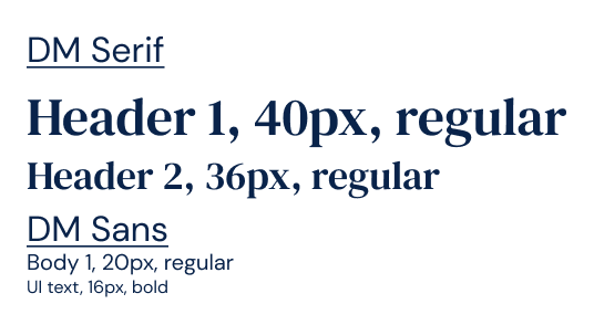
When choosing a typeface, I wanted to communicate a sense of trustworthiness, simplicity, and calmness, just like the colors. I chose DM Serif and DM Sans, which are from the same family but allow for more ornate headers and simple, easy to read body and component text.
Logo Design
When designing a logo, I wanted to make sure that I accomplished a few things:
Create an icon which is easily scaled and recognized on its own
Use a typeface which is easily legible
Bring attention to the word “well,” which communicates wellness and competence
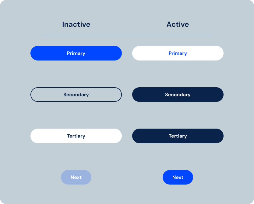
Buttons
High-Fidelity Designs
High-fidelity wireframing was my opportunity to put everything together. Taking components, UI elements, and feedback from peers and mentorship, I created high-fidelity screens which could be used in prototyping.
Creating interactive prototypes
Usability Testing
With high-fidelity wireframes ready to be prototyped for user-testing, it was time to connect signifiers and affordances.
Navigating from Dashboard
The first feature that needed to be prototyped and tested was the dashboard, which offers users navigation to both the check-in feature and their checklist.
Check-In Flow
The second feature which which needed to be prototyped was the check-in flow. This feature allows users to identify specific emotions and patterns experienced during each specific phase of their move, and then reflect on specific those experiences.
Checklist and Resource Page
The third and final feature which needed to be added was the checklist. This feature allows users to slide items from incomplete, to in progress, to complete. Additionally, users can click on items to gain more insight on specific moving tasks.
Testing for usability
With the first round of prototyping complete, I needed to see how real users would interact with the product. To accomplish this, I conducted usability tests with three participants.
I defined the metrics of success for the product as follows:
Users rate ease of use as at least a 5 out of 7.
Users experience no more than one pain point during each task flow.
Users can work through pain points on their own.
Users can navigate back to the dashboard after each task flow.
Findings
The usability tests offered valuable insights on how users would navigate the prototype, and also what pain points they encountered.
In relation to my predetermined metrics of success, I found:
No users ranked either task flow as less than a 5 out of 7, indicating that the prototype’s usability was sufficient.
No more than one pain point was observed by each user per task flow, also indicating that the prototype’s usability was sufficient.
All users were able to sufficiently work through any pain points on their own, and all problems were solved on a second or third attempt.
There were no issues with users navigating back to the dashboard/home screen.
Wrapping Up
Conclusion
This project offered great insights into how to be a flexible and empathetic designer. Moving is a difficult task which often causes a lot of difficulty for those who experience it, and after talking with users, I felt a deep responsibility to address that in my design.
My goal with MoveWell was to design a product which would help make moving a bit less difficult. Through mental health check-ins and comprehensive, easy to follow checklists, MoveWell is a product that accomplishes that goal.
I learned a lot throughout this project, not only about visual design, but also about user experience as a whole. Being able to adapt and pivot ideas to be more user-focused is important, and being open to critiques and feedback in order to make a better product is vital.


