Atelier
An app designed to create artists through the daily habit of drawing.
Role
UX/UI Designer
Duration
2 weeks
Project Type
End-to-End Design
Background
Habit-tracking apps are a useful and popular tool utilized for a variety of different activities. From Duolingo to Habit Tracker, there are many options to utilize when trying to increase productivity, accountability, and improvement.
Many people are afraid to try their hand at visual art. They may believe that they could never get good at it (whatever that means 🙄), that they aren’t creative enough, or that they don’t have enough time in their busy schedule.
All of these concerns are understandable, but they’re simply not true in most cases. There is no current accountability-encouraging app for the daily habit of drawing, and I sought out to change that.
Gathering Insights
Research
In order to ensure that I understand how to successfully design an application which would both fit in the market and meet user needs, I needed to conduct research to better understand what I would be creating.
Specifically, I needed to find out two things:
What do the currently successful habit-tracking apps have in common?
Would users want this app, and what features would they find useful?
Competitive Analysis
I looked at three successful habit-tracking apps and one art-focused app in order to identify strengths, weaknesses, and key features.
Specifically, I looked at the following apps:
Duolingo
Toggl Track
ArtWorkout
Habit Tracker
I found that they often shared fun, game-like UI which allowed users to feel rewarded for their accomplishments. I also found that they generally make a user’s “streak” a key focus in the user experience.
Now that I had a better understanding of what existing products looked like, I needed to talk to real-world participants to start mapping out my product.
User Interviews
I talked to five participants from diverse backgrounds and age groups.
I needed to try to figure out a variety of general user thoughts on drawing, habit-tracking, journaling, and reward systems, and then map out what common themes, topics, and interests were revealed during the interviews.
Finding patterns in user experiences
Affinity mapping allowed me to put participant responses in one place. By completing this exercise, I was able to recognize what patterns were revealed in relationship to the specific topics which I had earlier identified.
Affinity Mapping provided great insights on several commonalities among user responses, and clarity on what I could focus on while creating a product. Specifically:
Most users draw or sketch, at least sometimes.
Most users have used habit tracking apps and find them beneficial.
No users from interviews journal regularly, all citing time constraints as their reasoning.
Creating a feature set
Before creating wireframes, it was important that I listed features to include in the design which would help accomplish user needs and goals.
Defining Problems and Solutions
Creating Solutions
To more clearly understand what product I was to create from findings in my research, I needed to accomplish two goals:
Understand who my user was in order to design with more empathy.
Map out how my user would navigate the product.
Identifying the users
In order to better understand who my target audience would be while designing the product, I crafted a user persona around findings in my research.
Creating a sitemap
In order to start laying out what pages would be included in the application, I created a sitemap which would allow me to then further explore user actions.
Mapping out user flows
After deciding what pages and child pages would make up the app, I needed to explore how a user would navigate the pages and what decisions they could make along the way. To do this, I created a user flow.
Designing and Testing
Wireframes in Lo-Fi
Once user flows were created, it was now time to design the actual product. Starting with low-fidelity wireframes and moving upwards in fidelity, I learned three important lessons about the design process:
Don’t be married to ideas.
Work quickly in early sketches, and take more time as fidelity increases.
Constructive feedback and critiques are great assets to utilize.
Conceptualizing through sketching
My primary goal in low-fidelity wireframing was to sketch out some of the main screens and start building a visual framework around the user flows I had previously created.
Conducting user testing
Using my low-fidelity wireframes, I conducted user testing with five participants.
The goals of user testing were to find potential pain points and design flaws before moving up in fidelity, and to see if there are any additional features and pages that could be useful in high-fidelity designs.
This round of testing indicated three important notes:
That users liked the concept and overall design in low-fidelity.
That they would like a way to exit the session timer in case they have to cut their session early.
That it would be worthwhile to include illustrations and a gallery page.
Curating and refining
Branding and UI
Turning an idea into a brand
Before moving into higher-fidelity designs, I needed to create brand elements which would move the product into something unique and interesting.
Additionally, I needed to put together a UI kit which would include scalable, pixel-perfect elements to use in my high-fidelity designs and prototype.
Creating a style tile
I created a style tile which focused on three key visual elements:
Typeface
Color Palette
Logos
Choosing a typeface
I wanted the selected typefaces to communicate both historic and contemporary, old and new.
This is the world of art, after all, and I think that balancing a classic serif typeface with a san-serif successfully communicated the values of this product.
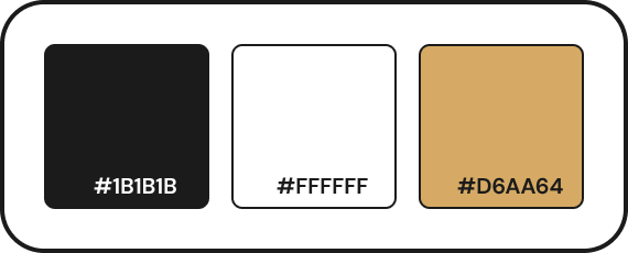
Curating a color palette
I wanted to keep the color scheme simple for this project in order to let user creations stand out amongst something equating a “blank slate.”
For this reason, I chose a monochromatic scheme with a gold accent color to make certain elements stand out.
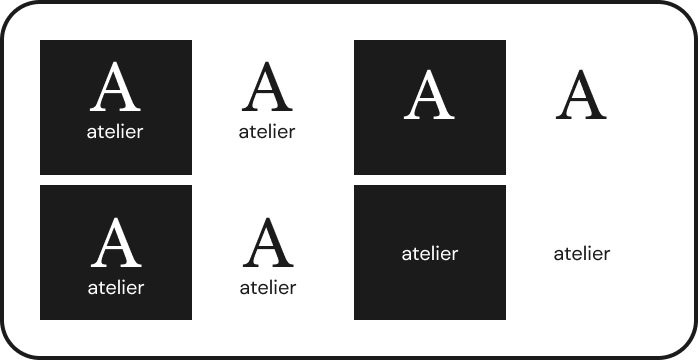
Designing the logo
When designing a logo, I wanted to make sure that I accomplished three goals:
Create an icon which is easily scaled and recognized on its own.
Communicate the sense of classic and contemporary.
Avoid overshadowing user creation by prioritizing simplicity.
Making users feel like true artists
One of the most rewarding experiences for an artist is seeing their work showcased in a gallery. Although most people will never experience this great accomplishment, I created a way for users to see their art being admired by enthusiasts in their very own exhibition.
In order to accomplish this, I compiled several images of people looking through actual art galleries and created silhouettes using the software tool Procreate. I also used Procreate to create an arrow signifying a scroll feature.
Creating elements for user interface
In order to create a seamless, pixel-perfect prototype in high-fidelity, I created UI elements with the following in mind:
Scalability - What elements would best fit across all prototype screens?
Brand Consistency - What element styles would fit brand guidelines?
Hierarchy - How can I communicate what elements are most important?
Necessity - How can I ensure users navigate easily with few signifiers?
Creating interactive prototypes
Usability Testing
With branding style guidelines created, it was time to get into high-fidelity prototyping and usability testing.
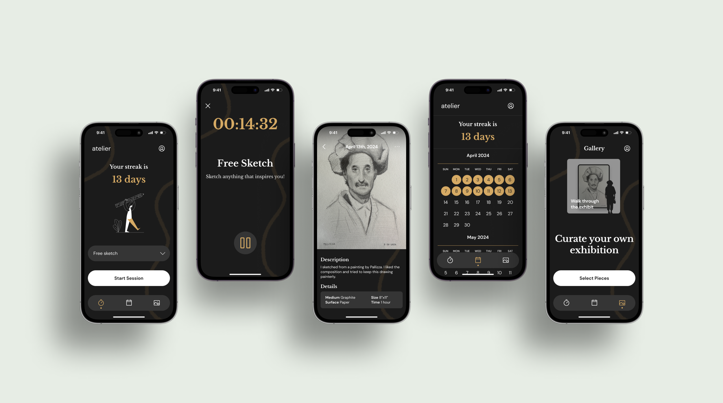
Completing a session
The first feature that needed to be prototyped and tested was the home screen, which works as an access point to the prompt selector and session timer. This will ensure that they can pick the prompt which inspires them and keep to a specific time window.
Viewing past sessions
It is important that users can view archived sessions that they have completed. The idea behind this experience is to allow users to see their progress and gather insights into what their process was for each piece they’ve created.
Exploring your gallery
One of the most endearing and satisfying experiences for an artist is to see their work showcased in a gallery. This flow allows users to curate their pieces into an interactive exhibition which they can scroll through with silhouetted viewers. This allows users to feel like a true artist, and adds a fun cherry on top to their hard work.
Testing for usability
In order to make sure that the now finished prototype was working properly, accomplishing user needs and goals, and communicating the necessary information through signifiers, I conducted usability tests with five participants.
I defined the metrics of success for the product as follows:
Users can successfully navigate through the app with no more than three pain points
Users can complete a daily session
Users can successfully find and view past projects
Users rate app’s ease of use at least a 5 out of 7
Results
The usability tests offered valuable insights on how users would navigate the prototype, and also what pain points they encountered.
In relation to my predetermined metrics of success, I found:
Users were all able to successfully navigate through the app with no more than three pain points.
Users were all able to complete a daily session.
Users were all able to successfully find and view past projects.
All users rated the app’s ease of use as at least a 5 out of 7.
Wrapping Up
Conclusion
Creating Atelier was a huge learning experience for me as a designer. I am passionate about the subject of this project, and that allowed me to really dig deep to try to create something that would help people experience something that I care so much about.
My goal with Atelier was to design a product which would help people maintain the daily habit of drawing. Through timed daily sessions, the ability to view past sessions, and the ability to craft an interactive gallery, Atelier is a product that accomplishes that goal.
I learned a lot throughout this project, including how to manage a project’s schedule and how to make elements and brand items which are scalable and consistent. I also learned how to open my mind to bigger ideas, even if they seem a bit crazy. Overall, this project has inspired me to be a more versatile, passionate, and creative UX designer.


